2008年11月26日 星期三
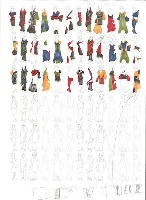
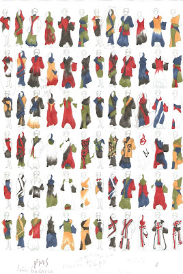
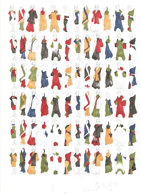
Final Project- Color Collections


 Advices form Robert:
- No absolute balance is needed
- The fluidity of color should be considered
- The focal point of the garment should be clear and color is one of the way to emphasize it
- Color;Size; Shade; Thickness, all of these criteria could be used on emphasizing the focus
- Conceptual connection is better than formal connection
- Fine Tune is needed
Final Project- Color Usage
 Pantone Number(PMS):
Red 84-1c
Green 289-3C
Black 223-1C
Yellow 27-4c
Blue 223-2C
White
Mood: Such color combination is inspired by the Greek Goddess "Eris", which in order to present the mood and concept of "Discord".
Symbolic Meanings:
Yellow: Golden Apple held by Eris
Red: Anger
Blue: Isolation
Black: Hatred
White: the Immortal
Color Theory: Triad( Red, Blue, and Green) and Complementary Color Pair of Red and Green.
Those two color theories are what Antonio Marras usually apply for his designs.
Final Project-Mood Board
Greek cultures and legends deeply influenced the Sardinia culture, and Antonio Marras had been inspired from the Greek legend "Atlantis" as his theme of his collection at Women's Wear 05, thus I predict Antonio Marras would get inspired from the Greek myth.
And the theme of the Antonio Marras' collection always in mood of isolation and sadness, therefore, the Goddness of Discordance, Eris, fulfill the above criteria.

2008年11月2日 星期日
Alternative Color used other than the Core Color
In fact, the alternative colors are dominated by the theme and the inspiration selected by Antonio Marras.
Taking A/W women's wear 2008-09 as an example, Antonio Marras using Red, Blue, and Green in his collection. The collection's theme is "To Charlotte Salomon", a German-Jewish. The colors used in this collection are actually what Charlotte Salomon's exhibition "Life? Or Theatre?" used and the tempra color she loves to use as painting, sculpture, etc.
2008年11月1日 星期六
Color Trend


Analysis: If simplifying all of his collection and view it's usage of color in the form of color wheel, we could easily spot out his tendency of using color.
First of all, it isn't hard to see that there is a increase of complexity on using color. Two tones of colors were used at very beginning, however, the complexity of color usage is increase accordingly. You could see that at A/W 2007-08, even seven various colors other than black, white, and greys are used.
Second, generally speaking, it seems that he use more color combination at A/W than S/S.
Third, it is most likely that, red is a "must" for color usage other than black, white, and grey. Only S/S 03 and S/S 98 are exceptions.
Forth, Triad is the most commonly used color theory. Complementary colors of Red and Green are also widely used. So do Tetrad.
To summarize, I would forecast the color usage of A/W 2009-10 is in even higher complexity, with red as the core color with black, white, grey, also coporate with others color under color theory of Triad and Tetrad.
Antonio Marras 2002 S/S


Theme: Amelie Posse Brazdova
2008年10月19日 星期日
Women's Wear S/S 2006
Antonio Marras 2008 F/W Color Proportion Analysis
Antonio Marras:
…I met Charlotte Salomon in the spring of 1939…
Charlotte was 22 years old, with hair soft and blood, blue eyes rosy cheeks, something stiff in her movements and with the shyness of a doe. She withdrew in herself in front of strangers and nothing distributed her more than being asked questions. Her parents considered her obstinate but Charlotte wasn’t so at all; she was extremely feminine and had an extraordinary inner life.
I me Charlotte by chance in New York in December of 2000.I went to The Jewish Museum and I saw her exhibition: Life? Or Theatre?
From that moment on I have never stopped thinking of her. It’s not only about her tragic destiny but it’s the power of her work which became an obsession for me.
Her gouaches (tempera color) are the result of a mix of languages, painting, sculpture, music and theater. Her work seems to be a movie story board with long shots, close-up, montage. The work is structure as a set, where a kind of a set, where a kind of family sage develops into complicated narrative plot, recalling classical Russian literature, with classical pieces and traditional baliads as soundtracks. The color are primary (red, yellow, blue) and white mixed together to create deep shades that evoke Chagall.
Last year at the “Montagnola” market in Bologna I chanced upon a rare book from 1963 dedicated to her. Here I just wanted to remember her.
“From email Strauss “A diary in pictures by Charlotte Salomon” Bomplani, Mailan1963
Mood: Such color combinations in dull, dusty tone create the mood of sad, tragic, but sightly cheer up beneath those negative tempers, in which relect the targic family saga of Charlotte Salomon.
Analysis: Other than the core color( Black, White, and Red) that Antonio Marrs usually use, the complementary colors on certain collection always being altered by the inspiration and theme.
The color are primary (red, yellow, blue) and white, which are being used in this collection likewise.
Color Family:


PMS:
Black:329-1C
Grey: 327-5C
Ivory:27-5C
Blue-240-1C
Red:79-1C
Acid Green:289-4C
Purple:155-2C
Brown:39-1C
2008年10月13日 星期一
2008年10月3日 星期五
Antonio Marras desired to rediscover his root
Antonio Marras has been always using the elements picked up from his island of birth. For example, the in the menswear collection for spring-summer 2005, dedicated to Tore Burruni, a boxer form Alghero who was famous in the fifties.
Antonio Marras who belong to a "failed nation" and are a prolong colonial past under his consciousness, this make he extremely open to theme linked to identity pr otherness.
in his house-cum-studio a whole room is filled with books devoted to Sardinian cultural movement and artistss who works, lives and projects he studies.
The haute courture parades Fili Lai Lai (S/S1997), Ligazzos rubios(A/W1997/1998), and Fogu. fogu(S/S1998) show intensive exploration on his culture.
his clothes do not generally echo the cuts of Sardinian costumes. Rather than that it is in their details that rediscovered past is celebrated.
Antonio Marras in the word of mouth from the others
Order and disorder, nature and culture, children's drawings and citations of artists. sophisticated hand-made embroideries and suturing stitches, exuberant colors and cult of the monochrome, connivance of different patterns: all this weaves a backcloth of which Marras is the author and, at the same time, the first person to be caught in its spell. Like a child. An all too wise child who dominates and directs a world where opposites coincide in unexpected harmonies. ( form Suzy Menkes, 2005)
2008年10月2日 星期四
The root color of Antonio Marras

You might say, why the combination of Red, Black, and Red could only inspired flag of Sardinia, but not other countries flag with same color pattern.
Designer uses the color combination to remind of his own country by both color selection and color ratio.
For example,
 You could not the be reminded of Germany by using the color of Red. Black, and White, as the color combination of traditional Germany is Black, Red, and Yellow.
Nonetheless, you might argue that the color combination of Black, Red and White are also the core color consisted in the Egypt country flag. Thus, could it possible Antonio Marras using such color combination to remind the culture of Egypt?
I could say that that answer is No. Other then the color selection, color ratio is another skill to express messages. The color ratio of Egypt flag of Red, Black, and White are in equal ratio, but Sardinia flag is in which under the ratio of Red: 20 Black:30 White:50. Accordingly, the color ratio in Antonio Marras Design follows similar color ratio.
To conclude, the color combination and color ratio of Antonio Marras Designs successfully deliver the conceptual message of his own country.
2008年9月28日 星期日
Check the Checked pattern!

Checked pattern composes of pretty much of colors, but it still brings into harmony, what is the secret behind?
Let's check it out!
By the color theory we've learnt, it's not hard to discover that they are composed with the theory of Triad.
Using different three colors in Triad, says, violet, orange and green, could also bring into harmony.
Better One?


However, under the color usage, 7-eleven seems better.
Circle-K only uses of sharp red as core color and thin blue edge in contrast, a warm and cool color in contrast. While, 7-eleven uses of the color theory of Single Split, blue green, red, and orange.
A.M. Color
Colors used from 1996-2006:
1996 (Haute Couture): Grey, black, brown, gold, silver, sage green, ivory.
1997 (Haute Couture): Black, grey, ivory, white, silver, traces of blues.
1998 (Haute Couture): White, grey, crimson, sulphur yellow.
1999 (Haute Couture): Shade of white and black, ecru, red stripe.
1999 (Women's wear A/W): Acid and rainbow tints, red, white, black.
2000 (Women's wear S/S): Accords of old rose and petroleum, grey and aubergine, white, brick red, red, black.
2001 (Women's wear A/W): White, grey, black, red, ecru, brown, turquoise.
2001 (Women's wear S/S): White, grey, black, ecru, red signs.
2002 (Women's wear A/W): Black and white, tea, ivory, turquoise, dark burhundy, brown, ecru, light grey.
2002 (Women's wear S/S): Red and blue, black and ecru, white.
2003 (Women's wear A/W): Bright tints like yellow, green, red, fuchsia and turquoise. White, black, ecru, brown.
2003 (Men's wear S/S): white, black, red, reddish, brown, light blue.
2003 (Women's wear S/S): White, black, grey-green, flesh.
2004 (Men's wear A/W): Black, grey, brown, white, blue, turquoise, red, and yellow.
2004 (Women wear's A/W): Black, grey, midnight, blue, graphite, mud ecru, red, white.
2004 (Men wear's S/S): White, blue, burgundy and ecru, black.
2004 (Women wear's S/S): Pink, white, black, yellow, fuchsia, apple green.
2005 (Men wear's A/W): White, black, dove grey, mud and grey. Splashes of yelllow, acid green and orange.
2005 (Women wear's A/W): Turquoise, white, black, cream, and a few touches of red.
2005 (Men wear's S/S): Ecru, faded blue, mud grey, white, black, lobster pink, turquoise.
2005 (Women wear's S/S): shades of white, powder,pink and beige, grey, faded blue, sage green.
2006 (Men wear's A/W): White, blure, brown, mud, black and a few of yellow, green , pink and burgundy red.
2006 (Women wear's A/W): Black, white, moss green, dark brown, light grey, mud, dark red.
2006 (Men wear's S/S): Blue, white, black, sage green, powder pink, fluorescent.
2006 (Women wear's S/S): White, black, dark blue, ivory, brown, burgundy, hunther green.Brand Audit
Brand: Antonio Marras
Designer: Antonio Marras, Italian Designer, Sardinian Designer strictly speaking, who is also the Head Designer of Kenzo.
Brief History: Antonio Marras, who ws borned in Alghero in Sarfinia in 1961. He was attracted to Fashion when he was firstly stepping in his father fabric shop. After spending years of experiments on fabrics and materials, he launched the first fashion shows under his own brand based on Italy.
The women who wears Antonio Marras: Antonio Marras's women is always that of an ineffable lightness and fairness. Under the definition of Antonio Marras, femininity could be expressed in the term, janas, the fairies of Sardinian tales.
"the janas are a little people, they are tiny, a bit more or a bit less than a palm's height. They dress in bright red, cover their heads with gaily-colored scarves, embroidered with gold and silver thread, and heavy necklaces of wrought gold." from Antonio Mancinelli ANTONIO MARRAS.
Chief executive officer: Antonia Marras also was hired to the Artistic Director of Kenzo of the women universe bus, under the appointment of LVMH group.
http://findarticles.com/p/
2008年9月20日 星期六
Color In Theory


Taking RED as an example,
if you want to wear a blouses in red, and a purple pant, you could simply match with a pair of green shoes and a yellow necklace, by applying the color theory of Double Split.


